

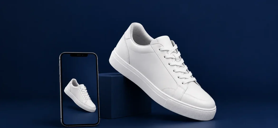
A buyer cannot pick up an online product, feel its finish, check its scale, or inspect how a logo is applied. Product photography has to do that work instead. For teams asking which photos improve ecommerce sales, the useful answer is not simply “more photos.” It is the right set of images, planned to remove the questions that prevent a purchase.
For branded merchandise, corporate gifts, retail goods, and campaign items, the image standard also affects brand perception. A well-made item can look generic, unreliable, or poorly finished when photographed without care. Conversely, clear and consistent photography helps buyers understand what they are choosing and gives marketing, procurement, and sales teams materials they can use with confidence.
Start With the Questions Buyers Need Answered
High-performing ecommerce images reduce uncertainty. Before planning a shoot, identify the questions a buyer is likely to have at the point of decision: What exactly is included? What color will arrive? How large is it? What does the material feel like? How will it look in use? Can I trust the quality?
The best photo set answers these questions in a logical order. The first image earns attention and establishes the product. Subsequent images provide proof. This is especially relevant when selling products that can be customized, such as uniforms, packaging, event materials, corporate gifts, or promotional merchandise. Buyers need to see not only the item, but also the quality of its finished presentation.
A single attractive hero shot may support awareness, but it rarely carries the whole sale. Detail, context, scale, and consistency work together to move a buyer from interest to action.
The Hero Image Should Make the Product Instantly Clear
The primary image is often the first impression on a category page, marketplace listing, search result, or social post. Its job is simple: make the product recognizable at a glance.
Use a clean composition, sufficient lighting, and a viewpoint that shows the main form of the item. The product should occupy enough of the frame to be understood on a mobile screen without appearing cropped or distorted. A plain background is often the right choice for catalog listings because it keeps attention on the item and makes a product range look organized.
For brands with a broader visual identity, the background does not need to be stark white in every channel. A considered neutral or branded setting can work well on a campaign landing page or lookbook. The trade-off is clarity. If a styled environment makes the product harder to identify, it is better used as a supporting image rather than the lead visual.
Color accuracy matters here. If the item is available in several colors, show each option honestly and consistently. Heavy filters, inconsistent lighting, and retouching that changes the material color create avoidable disappointment after purchase.
Detail Photos Turn Claims Into Evidence
Product descriptions can say “premium finish” or “durable material,” but close-up photographs make those claims more believable. Detail images are among the photos that most directly improve ecommerce sales when quality, craftsmanship, or customization is part of the decision.
Photograph the stitching on a tote bag, the texture of a notebook cover, the closure of a gift box, the print quality on packaging, or the engraving on a branded item. For apparel, show fabric texture, seams, fit-related features, and decoration methods. For printed materials, reveal paper stock, finishing, folds, and important design elements.
These images should be purposeful, not repetitive. A close-up should show something a standard product shot cannot. If a buyer is paying attention to how a logo reproduces on different surfaces, provide a clear image of that application at a realistic viewing distance, then another closer view if the technique deserves inspection.
Care is needed with retouching. Dust removal and minor cleanup are appropriate, but editing away the texture, edge, or natural variation of a material can make the product look misleadingly perfect. The goal is polished presentation with honest representation.
Context Images Help Buyers Picture the Outcome
A product can be technically clear and still feel abstract. Lifestyle and in-use photographs close that gap by showing how an item fits into a real setting.
For example, a branded drinkware item can be shown on a work desk or at a company event. A welcome kit may be photographed as it is received by a new employee. A retail package can be placed in the hands of a shopper, while event signage can be shown at the scale of an actual venue. These images communicate purpose, proportion, and emotional relevance at once.
The setting should support the product, not distract from it. Overly elaborate props, crowded scenes, or locations that do not match the buyer’s situation can weaken the message. A corporate procurement team may need to see how a gift set is presented at a formal function, while an SME owner may respond better to a practical image that shows the item in daily use.
People in photos can add energy and trust, particularly when they demonstrate use. Choose casting, styling, and environments that align with the intended customer and the brand’s standards. The aim is not to create a generic stock-photo moment. It is to make the final experience easier to imagine.
Scale Photos Prevent the Wrong Assumptions
Size is one of the most common sources of online purchase hesitation. Measurements in a specification table are necessary, but many buyers do not easily translate centimeters or inches into a real-world mental picture.
Show the product beside a familiar object when appropriate, or photograph it being held, worn, carried, or placed in its intended environment. A notebook inside a bag, a lanyard worn by a person, or a display stand positioned on a reception counter gives immediate context. For kits and bundles, a flat-lay image showing every component is useful because it confirms what is included.
Scale photography is especially valuable for corporate orders because decision-makers may be approving an item on behalf of other people. They need confidence that the size and presentation will suit employees, guests, or event attendees. Clear visual evidence reduces back-and-forth and supports faster internal approval.
Show Variations Without Creating Confusion
Customization and product options are commercially valuable, but only when buyers can see what changes. If colors, sizes, materials, finishes, or logo placements vary, use images that clearly identify each variation.
A consistent image angle makes comparison easier. If one color is photographed in bright daylight and another under warm indoor lighting, the customer cannot tell whether the difference is real. Similarly, if a product can be printed, embroidered, engraved, or embossed, show each method where relevant. This helps buyers select the approach that best fits their brand and intended use.
For complex customized projects, an image sequence can communicate the progression from item to finished branded piece. It should not imply that every design produces identical results. Different artwork, material choices, and print areas can affect the final appearance. Setting that expectation visually is more useful than overselling a single example.
Build Consistency Across the Entire Product Range
The strongest ecommerce photography does not treat each listing as an isolated task. It creates a recognizable visual system across the catalog.
Maintain consistent lighting, camera angles, cropping, backgrounds, and editing standards. This makes browsing easier and reinforces that the business operates with care. It also gives marketing teams reusable assets for digital catalogs, campaign materials, presentations, and event communications.
Consistency does not mean every photo must look identical. A hero image may follow strict catalog rules while supporting images use more contextual styling. What matters is that the customer still recognizes the same product and the same brand standard across every touchpoint.
For organizations managing multiple products, suppliers, or campaigns, a defined photography brief is practical. It should specify required views, intended channels, background approach, color requirements, brand guidelines, file formats, and approval responsibilities. This prevents costly reshoots and reduces the risk of inconsistent assets appearing across the customer journey.
Match the Photo Mix to the Product and the Buyer
There is no universal number of images that guarantees better results. A simple, familiar item may need a strong hero image, one detail view, one scale photo, and one context image. A high-consideration product, curated gift set, or customized corporate item may need more evidence because the buyer has more questions to resolve.
Review customer inquiries, cart abandonment feedback, and sales-team questions to find the gaps. If customers repeatedly ask about dimensions, add a scale image. If they question print quality, show close-ups of the actual finish. If they struggle to understand how a set is presented, photograph the unboxing or display arrangement.
Diverse Solutions approaches branded product presentation as part of the wider brand experience, not as a last-minute production step. When photography, creative direction, customization, and delivery requirements are considered together, the result is more consistent and more useful across ecommerce and campaign channels.
The most effective product images do more than make an item look appealing. They help a buyer feel informed, prepared, and comfortable choosing. That confidence is often the difference between a product page that is merely viewed and one that supports a meaningful business decision.
