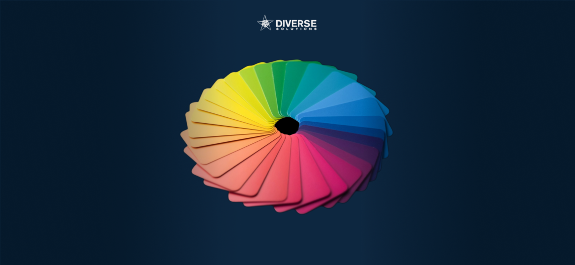
Color is one of the most powerful tools in a brand’s identity system. It influences emotions, shapes perception, and affects how customers interact with a company—often within seconds. For businesses aiming to create a strong and cohesive visual identity, Mastering Color Psychology is essential.
With the right color choices, brands can communicate values, evoke emotion, and create memorable experiences that resonate deeply with their audience.
Understanding Color Psychology in Corporate Design
Color psychology examines how different hues influence human behavior and perception. In corporate design, this means using color intentionally to:
- Establish a clear brand personality
- Build deeper emotional connections with customers
- Improve brand recognition and recall
- Influence customer decisions and actions
-
Create visual consistency across platforms
When a company truly invests in Mastering Color Psychology, its branding feels purposeful, cohesive, and instantly recognizable.
How Colors Communicate Meaning
Each color evokes specific emotions and associations. Understanding these meanings helps brands select palettes that align with their identity and messaging.
Blue — Trust & Reliability
Commonly used in finance, technology, and healthcare, blue conveys stability, security, and professionalism.
Red — Energy & Passion
Red captures attention and stimulates excitement. It works well for bold, dynamic, and action-oriented brands.
Green — Harmony & Growth
Associated with nature, sustainability, and wellness, green is often used by eco-conscious and health-focused brands.
Yellow — Positivity & Optimism
Bright and uplifting, yellow communicates friendliness, creativity, and optimism.
Black — Sophistication & Strength
Timeless and confident, black represents luxury, authority, and elegance.
Purple — Creativity & Imagination
Purple is linked to innovation, artistry, and premium experiences.
These emotional cues allow businesses to build brand identities that feel intentional and aligned with their values.
Why Color Consistency Builds Strong Brand Recognition
Consistency is a cornerstone of effective corporate design. Using the same color palette across websites, packaging, merchandise, and marketing materials reinforces brand memory.
When audiences repeatedly associate specific colors with your company, those colors become part of your visual signature. This consistency is a fundamental aspect of Mastering Color Psychology, ensuring your brand is recognizable at a glance.
Using Color to Guide User Behavior
Color doesn’t just evoke emotion—it also influences behavior and decision-making. For example:
- Red or orange can create urgency in calls-to-action
- Green suggests confirmation, safety, or success
-
Blue increases trust, especially when users enter sensitive information
In UI/UX design, branding, and physical spaces, color subtly guides users through experiences in powerful ways.
The Importance of Cultural Context in Color Psychology
Color meanings can vary significantly across cultures. For global brands, understanding these differences is essential.
- Red symbolizes luck and prosperity in parts of Asia, but danger or warning in Western cultures
-
White represents purity in some regions and mourning in others
Mastering Color Psychology means accounting for cultural context and adapting color strategies to resonate with international audiences.
How to Create a Balanced Corporate Color Palette
A well-designed corporate palette typically includes:
- Primary colors: Core brand colors used across major touchpoints
- Secondary colors: Complementary hues that add flexibility and depth
- Neutral tones: Whites, greys, and blacks to enhance readability and balance
-
Highlight colors: Used sparingly to draw attention or emphasize key elements
This structure ensures a flexible yet cohesive visual identity system.
Using Color Across Packaging, Print, and Digital Media
Color plays a distinct role across different media:
- Packaging design: Creates shelf impact and emotional connection
- Print materials: Communicate professionalism, clarity, and trust
-
Digital platforms: Influence behavior through UI elements and experience flow
Each medium amplifies color differently, reinforcing why Mastering Color Psychology is vital for holistic corporate branding.
Test, Refine, and Adapt Your Color Strategy
Colors behave differently on screens, in print, and under various lighting conditions. Prototyping, testing, and user feedback ensure color choices remain effective across all brand touchpoints.
Brands that continuously refine their color palettes stay visually relevant, intentional, and engaging.
Conclusion: Why Mastering Color Psychology Matters
Mastering Color Psychology empowers companies to design brand experiences that are memorable, emotionally resonant, and strategically aligned. Color is more than decoration—it is a visual language that shapes how people feel and respond to your brand.
When used intentionally, color becomes one of the most influential tools in corporate design, strengthening brand identity and elevating every interaction.
For more information and to explore our offerings, visit Diverse Solutions Singapore.

