

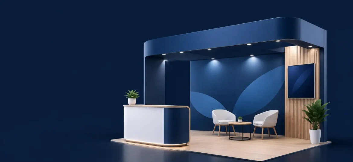
A trade show booth branding example is most useful when it shows more than an attractive backdrop. It should reveal how a brand earns attention in a busy hall, communicates its value in seconds, and gives staff a practical setting for meaningful conversations. For marketing and event teams, the real challenge is not filling a booth with graphics. It is making every visual, physical, and printed element work toward one clear business purpose.
A booth can be compact and still feel considered. It can also be large, expensive, and easy to walk past if visitors cannot quickly understand who the organization serves or why they should stop. Effective booth branding combines creative judgment with disciplined planning, production quality, and on-site execution.
A Trade Show Booth Branding Example in Practice
Consider a business-to-business software company exhibiting at an industry conference. Its goal is to introduce a new platform to operations leaders, generate qualified meetings, and reinforce its position as a practical, dependable partner.
Instead of covering every wall with product features, the company centers the booth around one direct message: “Simplify complex operations.” That statement is placed high on the main back wall, where it can be read from the aisle. The company logo is visible, but it does not compete with the message. A supporting line below identifies the intended audience and the outcome: “One connected view for growing teams.”
The color palette follows the company’s established identity – a deep blue base, white type, and a restrained accent color used to guide attention. The booth uses open sightlines rather than tall, enclosed partitions. Visitors can see a large screen showing a short product workflow, a consultation counter for scheduled demonstrations, and a small seating area for longer discussions.
At the front edge of the space, a simple floor graphic marks where visitors can stand to view the demonstration. Staff wear coordinated apparel with a discreet logo and a role identifier, helping attendees know who can answer product questions. Printed one-page overviews use the same headline, colors, icon style, and product imagery as the booth itself. The experience feels connected because it is designed as one system, not as separate event items ordered at different times.
This is a strong example because the visual choices support visitor behavior. The high-level message earns a glance. The screen gives visitors a reason to pause. The counter and seating area make it easier to move from interest to conversation. The collateral gives attendees something clear to take away after the event.
What Makes the Example Work
The strongest trade show booths are built around hierarchy. An attendee walking past should be able to recognize the brand, understand the main offer, and see an obvious next step without reading a wall of copy. This usually means prioritizing one primary message, then adding only the details that help a visitor decide whether to engage.
For the software company, the phrase “Simplify complex operations” leads. It is not a technical product description, but it names a business problem the audience recognizes. The supporting line narrows the relevance. Product details appear later, during a demo or in a conversation with staff. This sequence respects the reality of a trade show floor, where attention is brief and distractions are constant.
Brand consistency also matters beyond the logo. Typography, photography, color, tone of voice, and material finishes should feel like they belong to the same organization. A premium professional-services brand may benefit from restrained graphics, clean materials, and a consultative meeting setting. A consumer-facing product brand may need bolder imagery, sampling stations, or hands-on displays. There is no single right booth style. The right approach depends on the audience, objective, venue rules, and how visitors are expected to interact with the brand.
Physical layout is equally strategic. A crowded booth with too many display units can make conversations difficult. On the other hand, an overly minimal space may lack enough visual interest to stop traffic. The practical balance is to create distinct zones without making the footprint feel fragmented: an attention zone facing the aisle, an engagement zone for demonstrations or product interaction, and a conversation zone for qualified leads.
Translate Brand Strategy Into Booth Elements
Before design begins, teams should agree on what the booth needs to achieve. Is the priority brand awareness, product education, lead capture, partner meetings, recruitment, or event visibility? A booth cannot give every objective equal weight. Defining the primary goal helps determine the right investment of space and attention.
A useful planning brief identifies the target visitor, the one message they should remember, the desired action, and the proof that will make the message credible. For example, a sustainability-focused organization may use material samples, project imagery, or a concise impact statement to support its positioning. An education institution may use student outcomes, program visuals, and approachable conversations with representatives. The booth should make that evidence easy to find, not bury it in dense text.
From there, the key elements can be aligned:
- Backdrops and fabric walls establish the visual anchor and provide the clearest place for the core message.
- Counters, display stands, and shelving shape how visitors approach products, samples, brochures, or demonstrations.
- Digital screens and interactive displays add movement and explanation, but should support the message rather than replace it.
- Printed collateral and branded giveaways extend the experience beyond the booth when they are relevant, useful, and visually consistent.
- Staff apparel, name badges, and signage complete the presentation and help visitors navigate the space with confidence.
Not every booth needs every component. A limited footprint may call for a strong backdrop, a well-designed counter, and a focused digital presentation. A larger activation may require meeting areas, multiple display surfaces, branded environmental graphics, and coordinated logistics. Adding elements only because they are available can dilute the message and complicate setup.
Design for the Event Environment, Not Just the Mockup
A booth design can look compelling on screen and still underperform on the exhibition floor. Viewing distance, lighting, neighboring exhibitors, venue restrictions, crowd flow, and installation time all affect the final result. This is why production planning should sit alongside creative development from the beginning.
Text that appears readable on a design proof may be too small from an aisle away. Glossy materials may reflect overhead lighting. A screen placed behind a counter may be blocked by visitors. Heavy product samples may require reinforced display furniture. Even a well-designed backdrop can lose impact if the graphics are not installed with proper alignment and tension.
Teams should also consider what happens before and after the event. Will booth components be reused across multiple exhibitions? Can graphics be updated without replacing the entire structure? Is collateral easy for staff to replenish? Are packing, delivery, installation, and dismantling coordinated around the event schedule? These operational questions are not separate from branding. They protect the quality and consistency of the brand experience under real event conditions.
For organizations managing several suppliers, this stage often creates unnecessary pressure. Creative design, print production, merchandise, display fabrication, and event setup need to connect closely. Working with an integrated branding partner can reduce handoffs and help ensure that the approved design is carried through accurately across every touchpoint.
Common Choices That Weaken Booth Branding
One frequent issue is trying to communicate everything at once. Long service lists, multiple taglines, small logos, and dense feature panels may satisfy internal stakeholders, but they ask too much of a passing visitor. A trade show booth should open a conversation, not function as a complete corporate brochure.
Another issue is treating giveaways as the main attraction. Useful branded items can support recall, particularly when they fit the audience and event context. However, they should not compensate for an unclear value proposition. Visitors may collect an item and still have no memory of the organization behind it.
Finally, inconsistency can quietly undermine credibility. A polished booth paired with outdated brochures, mismatched staff apparel, or generic sales materials creates a fragmented impression. The visitor may not identify the issue consciously, but the experience feels less dependable. Consistent execution signals that the organization pays attention to detail.
Turn Attention Into a Useful Next Step
The best booth branding gives staff a natural way to continue the conversation. That might be a live demonstration, a consultation booking, a product sample, a short assessment, or a concise leave-behind tailored to the visitor’s needs. The next step should be visible but not forced.
For the example software company, the screen demonstration attracts interest, while a clear invitation to book a 15-minute workflow consultation gives qualified visitors a reason to stay. Staff can ask a relevant opening question, such as which part of operations currently creates the most manual work. The booth then becomes a setting for discovery rather than a static display.
A well-branded booth does not need to be the loudest space on the floor. It needs to make the right people feel that the organization understands their needs and is prepared to deliver. With clear strategy, consistent creative, quality production, and reliable event coordination, a temporary exhibition space can leave a lasting business impression.
